
For a large multi-site provider network
Our client requested an experience design overhaul when data showed users were overwhelmed at becoming a new patient because the website was confusing and the provider search was outdated.

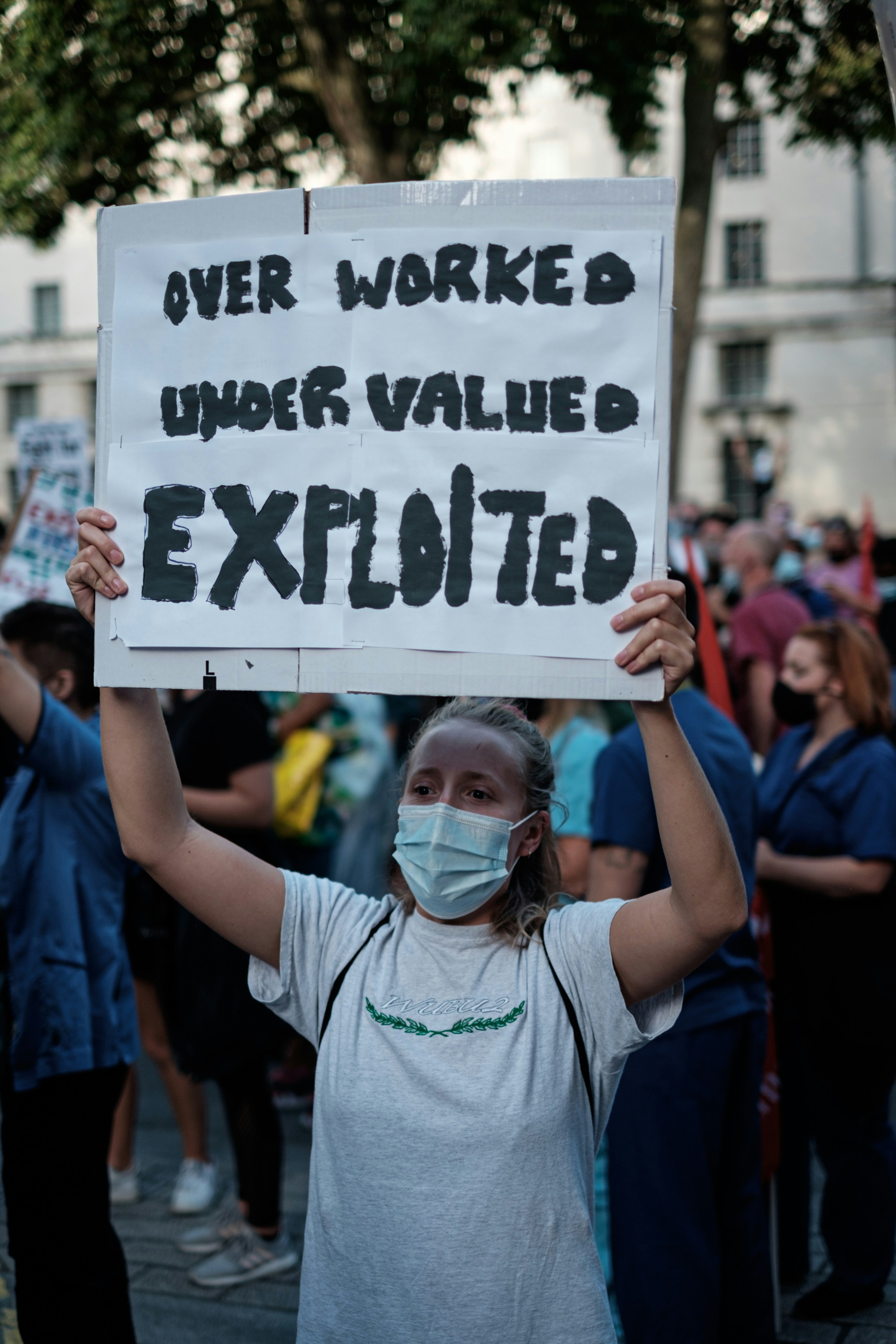
Caregivers communicated with their words, and completed their charting by hand, with a pen in the patients file. It was a profession that was known to be hard but the biggest complaint was about how their feet would be sore from long shifts.

Nope, your nurse isn't being "rude" and texting someone while they're in your room. They are communicating internally with their team on an iphone app.
It has its own problems. Concerns like device sanitation, accessibility, and unforeseen physical consequences like neck strain, repetitive stress injuries.
%201.png)
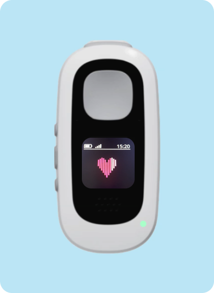
"Nurses don't want to have to lug around a big huge phone, along with their badge, plus their "other" phone where ever they go. They use "this" phone" for *this, and "that" phone" for *that. and it has an overwhelming effect. They want an easier more streamlined way to communicate."
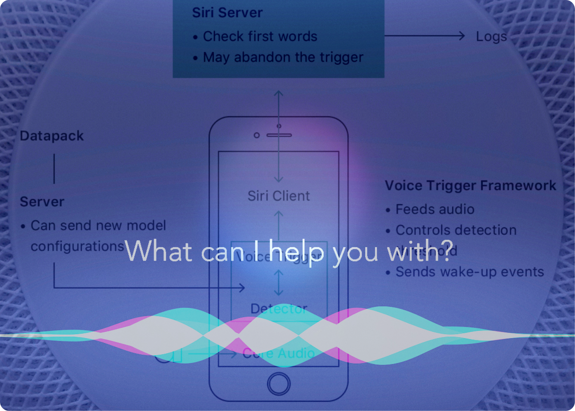
I analyzed competitor products to assess the range of language inputs it understood. I also assessed technology like Alexa and Siri to understand the interactions involved. Since we needed to build a prototype before the first round of usability testing, we resourced from the subject matter experts on our team about the natural language they would use in the workplace setting. Ideally, we would have been able to do the qualitative research before we went into the first round of usability testing, but instead the first interactions with real users was later on.
The idea of a sound interface was new to everyone on our team, so I did some research. I had to learn a lot about haptics, vibration and so forth.
Developing the sounds was also about developing the brand look and feel.
I decided we needed a sound landscape that would have more of a soothing effect since the product would likely sometimes be near patient's faces when the nurses were hovering over them.
Eventually I realized we needed to hire a sound engineer to design a tailored set of sounds. I sent out an RFP, to some renown sound designers.
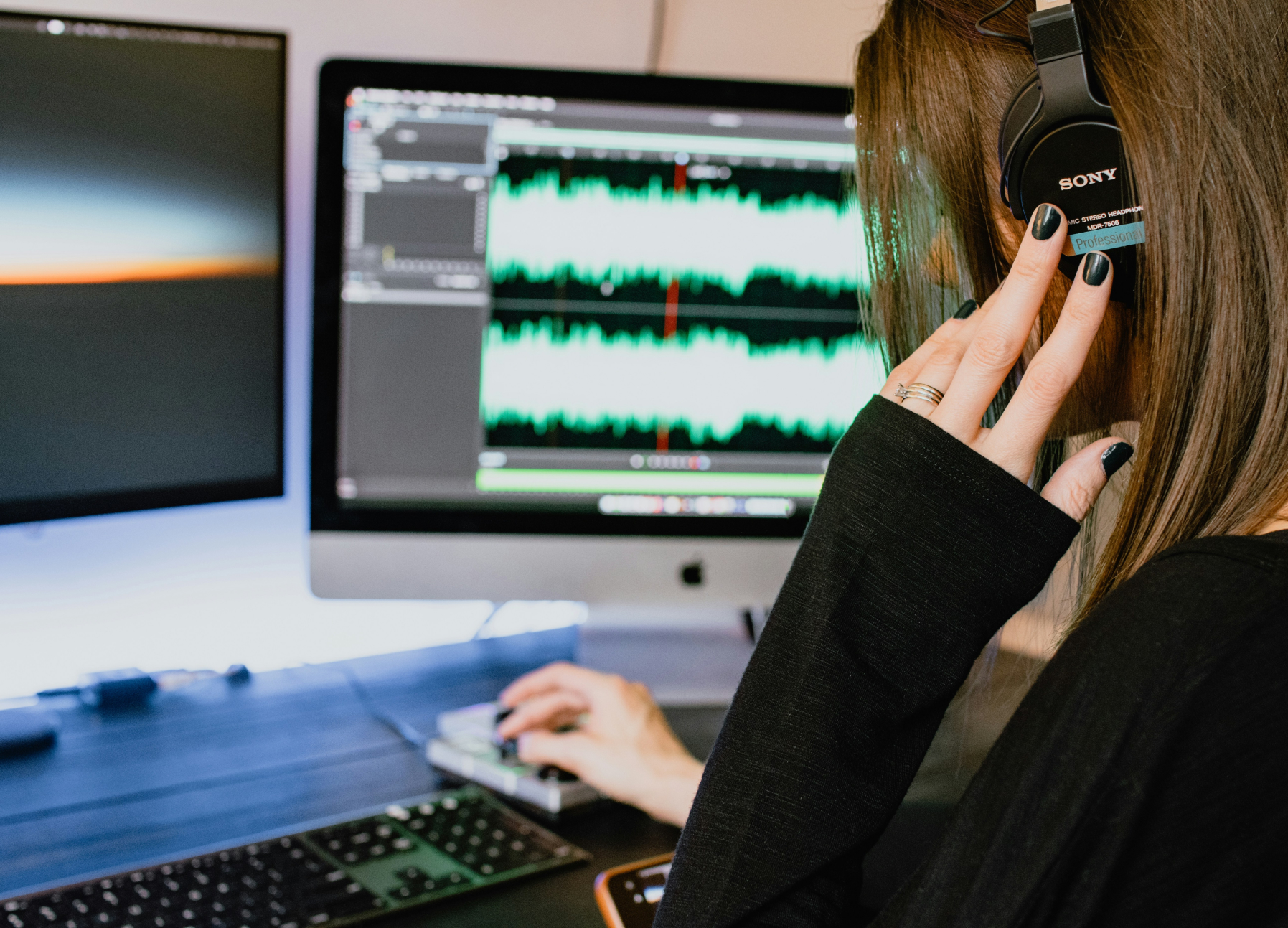
I collaborated with the lead on the team to figure out what all the lights and sounds would mean. They had done alot of work already, but I searched for sound files and put out an RFP for a sound interface engineer to record custom sounds that aligned with the proposed brand feeling instead of just purchasing generic tones. We refined this chart all throughout the design process. I also helped to define some of the rules around volume.
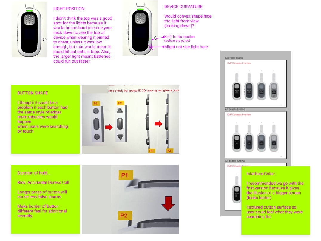
I helped with discussions on light position, device curvature, button shape, in order to minimize potential user errors and patient risks.
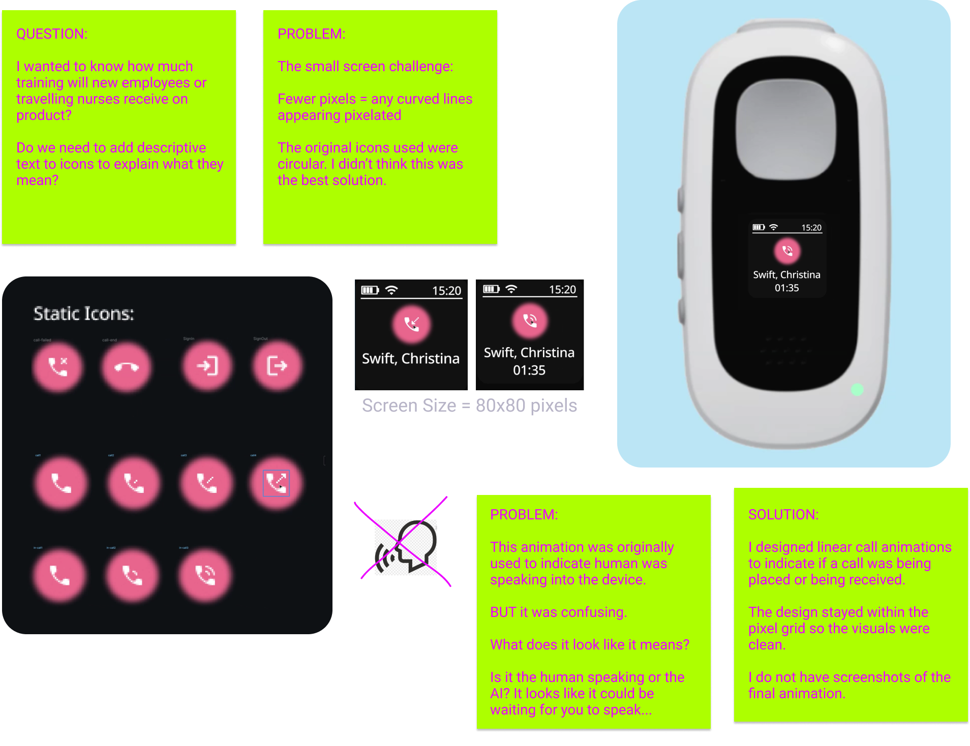
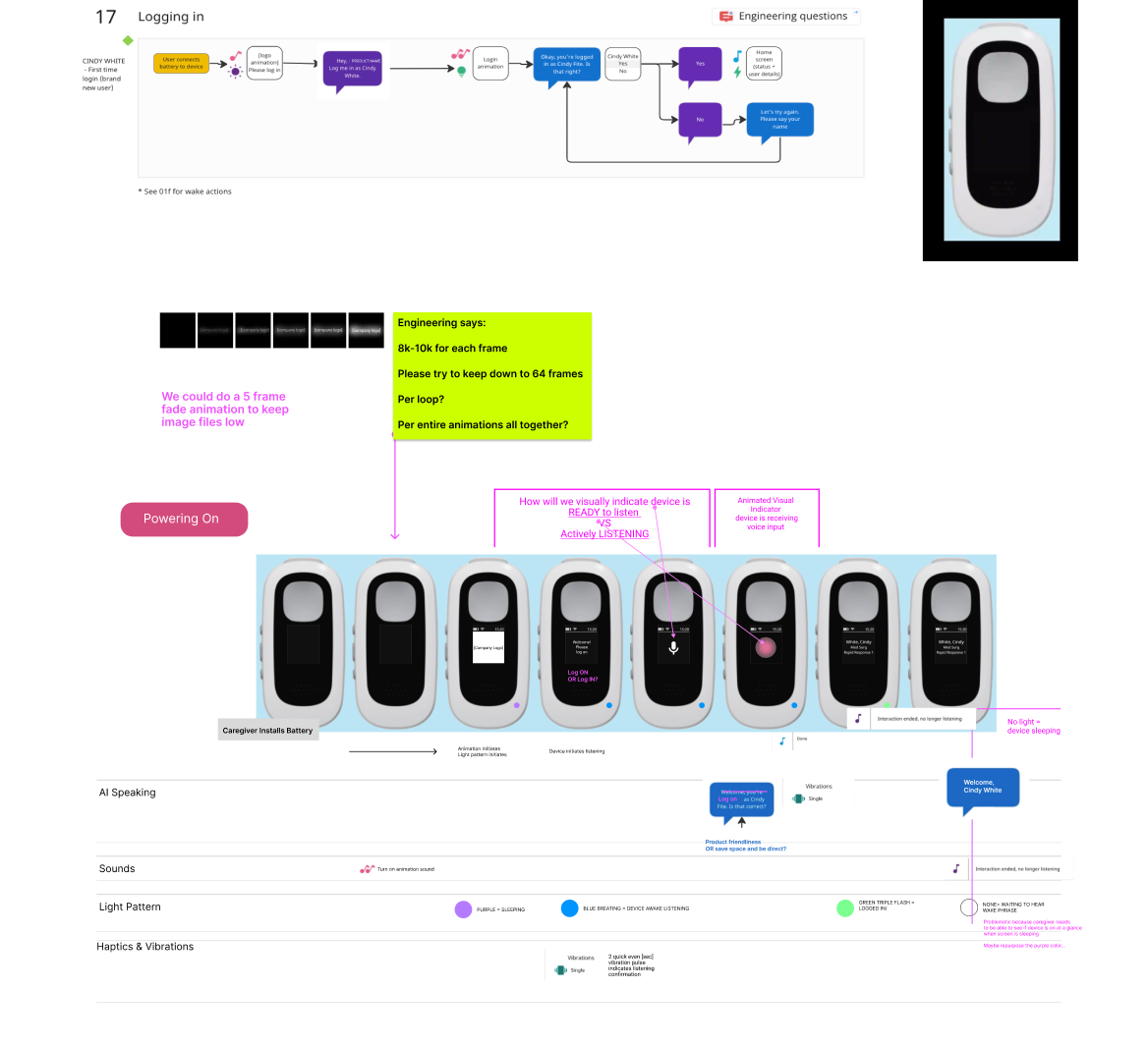
Constraints: The screen had to be very small so it wasn’t too heavy. it was about 80x80 square pixels and we needed to fit everything within that space and have it be easily readable without pixelating like shown below.
How might we indicate:
Device is ready to be listening?
Device is actively listening?
Device is processing the command?
There needed to be an indicator that the device was actively receiving voice input and commands from the user.
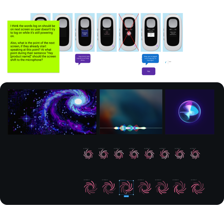
The galaxy theme was recommended originally for animations, so I started playing with animations that resembled galaxy like movements. I also looked at Siri and other voice applications to see how they visually indicated voice recognition.
I collaborated with my team to help refine what the login process would be in MIRO. This included what language would be used, what the device would say in response, colors, sounds and vibrations.
I created animations for what it would look like for a user to power the device on and then login. The goal was to illustrate how signifiers (listening, speaking, recording, complete) could work. This would be refined later.
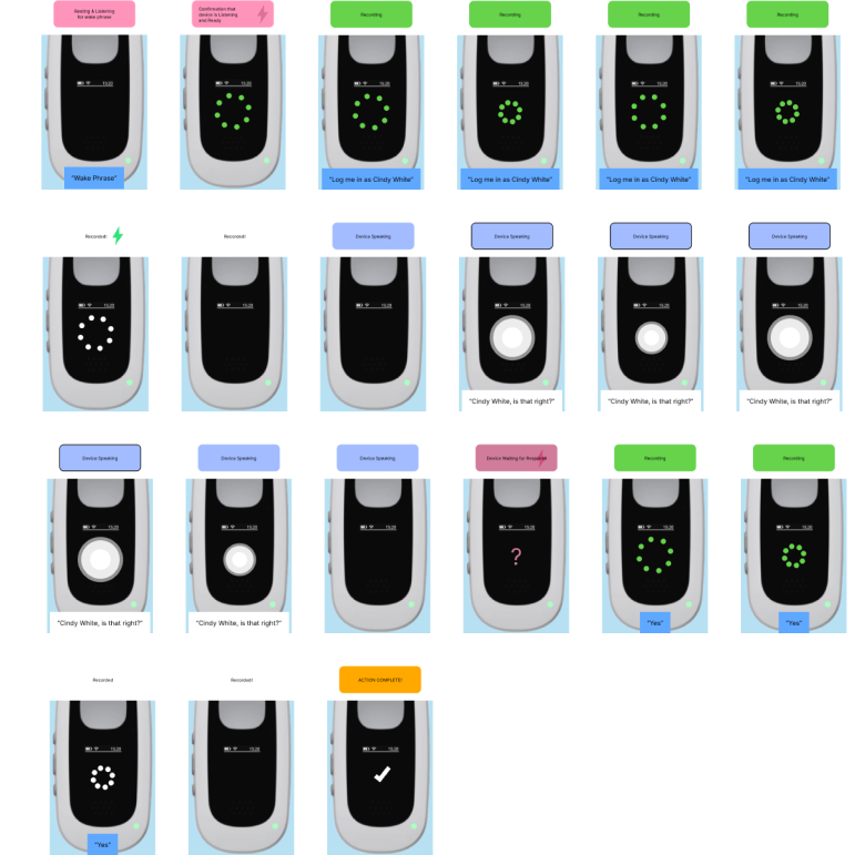
As the project moved along, I refined the animations that indicated the device was listening or speaking, and if calls were incoming or outgoing.
I chose brand colors for the device that seamlessly integrated with our other products
Again, the problem of large square pixels was something to work around.
I decided to use an image of a heart beat that used vertical lines to solve that problem and convey the brand messaging about saving lives and communicate a friendly feel.
QUESTION: Could it be problematic that the animation looked like a heart monitor?
ANSWER: No. And I don't remember the specifics.

As I mentioned earlier, user interviews and the first round of usability testing was done at the same time.
We planned to do usability testing and qualitative interviews in the lab with the rough prototype I helped to refine.
I joined a small team of three, which included the SME, and the Senior Human Factors Engineer to define the tasks that participants would be asked to perform, and the follow up questions, which we reviewed and refined with the larger group.
We planned tasks an in person wizard of oz style test, that utilized a person behind a curtain to act as the voice of the product.
We set up the participants in the hospital and asked them to pretend they were actually caring for a patient at their bedside while pretending to use the device. This helped to discover problems or things we didn't know.
Alot of the testing was around what language patterns Nurses use to do things. We looked for patterns and outliers.
During testing I had transcribed all of the conversations that were had, and took notes.
After testing we evaluated the notes tallied scores, and made design pivots if needed. Then we worked out more call flows etc.
Then I went to a new project. Which is featured in another case study.