Heuristic Evaluation and Cognitive Walkthrough of Authoring Experience on Clients Platform.
%202.png)
Problem: The authoring platform was confusing to use and the onboarding directions were even more confusing. Authors and Employees using the platform needed documentation and an easy onboarding to learn how to use the system.
UX Consultant
• Client
• Business Systems Analyst

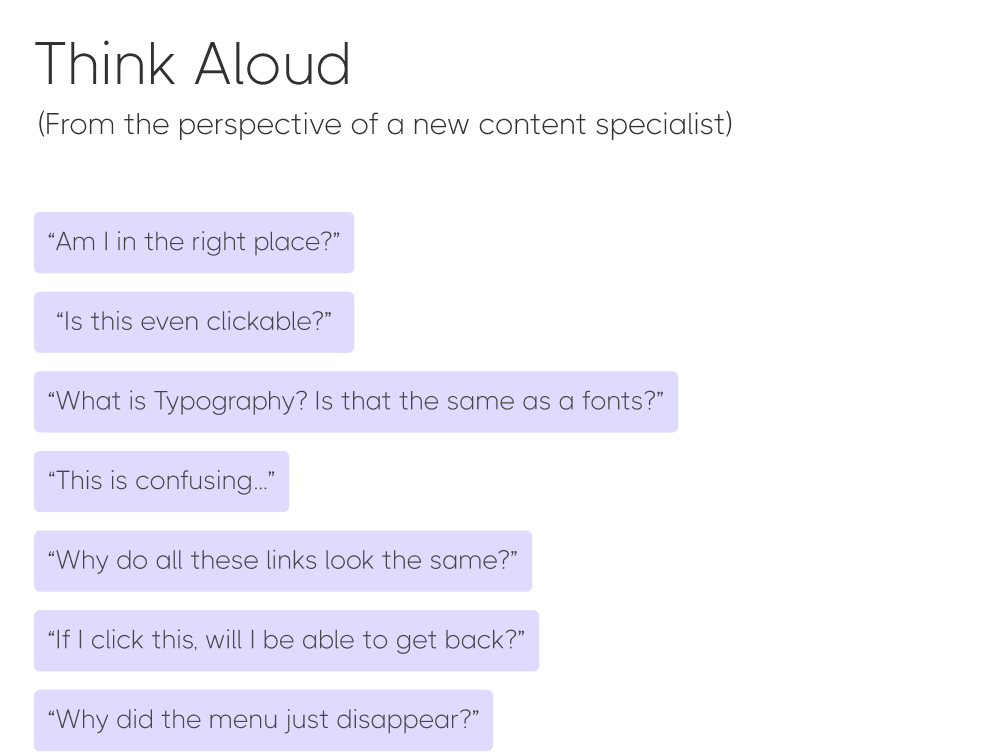
I reviewed the onboarding system, imagining I was a new author or content editor, step-by-step and made notes of things that were confusing.

USER NEEDS:
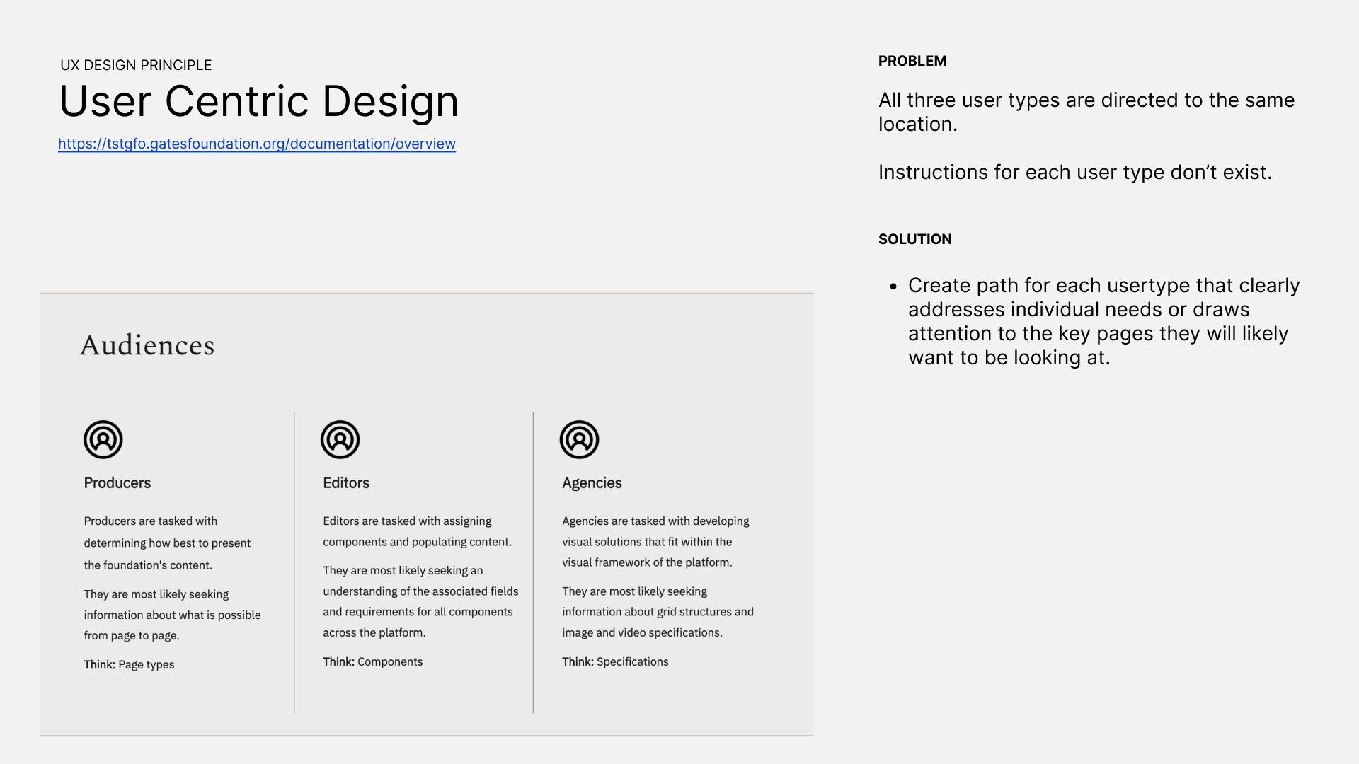
Three different user types (Producers, Editors and Agencies) need access to different information in different sequences because they have different processes of doing their work.
Ex. As an editor I need to understand the associated fields and requirements for all components across the platform so I can assign components and populate content.
PROBLEM:
All three user types were directed to the same location and menu.
SOLUTION:
Create a landing page that acts as a launchpad for each user type that addresses their individual needs or draws attention the the key reference pages they will likely want to be looking at.
PROBLEMS:
- The search feature was hidden below the fold.
- User control was impacted because search only visible when "Overview" page is active, giving the impression that a users search results would only contain results within the "Overview" category.
SOLUTION:
- Move search to a consistent location across all pages
- Label "Search All Documentation" or " Search xxx"

PROBLEM:
- Section labels were not intuitive.
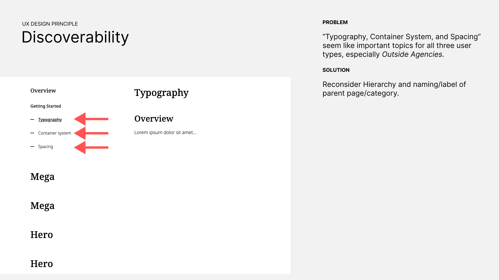
- Nesting "design principles" under "overview" was misleading. We added a parent section and ditched the internal jargon, and recommended a clear label such as "design guidance", or "brand guidelines" instead of "getting started" because who knows what that could mean.
SOLUTION:
- Reconsider Hierarchy and naming/label of parent page/category
RECOMMENDATION:
- Recommended user research card sorting exercise.
PROBLEM:
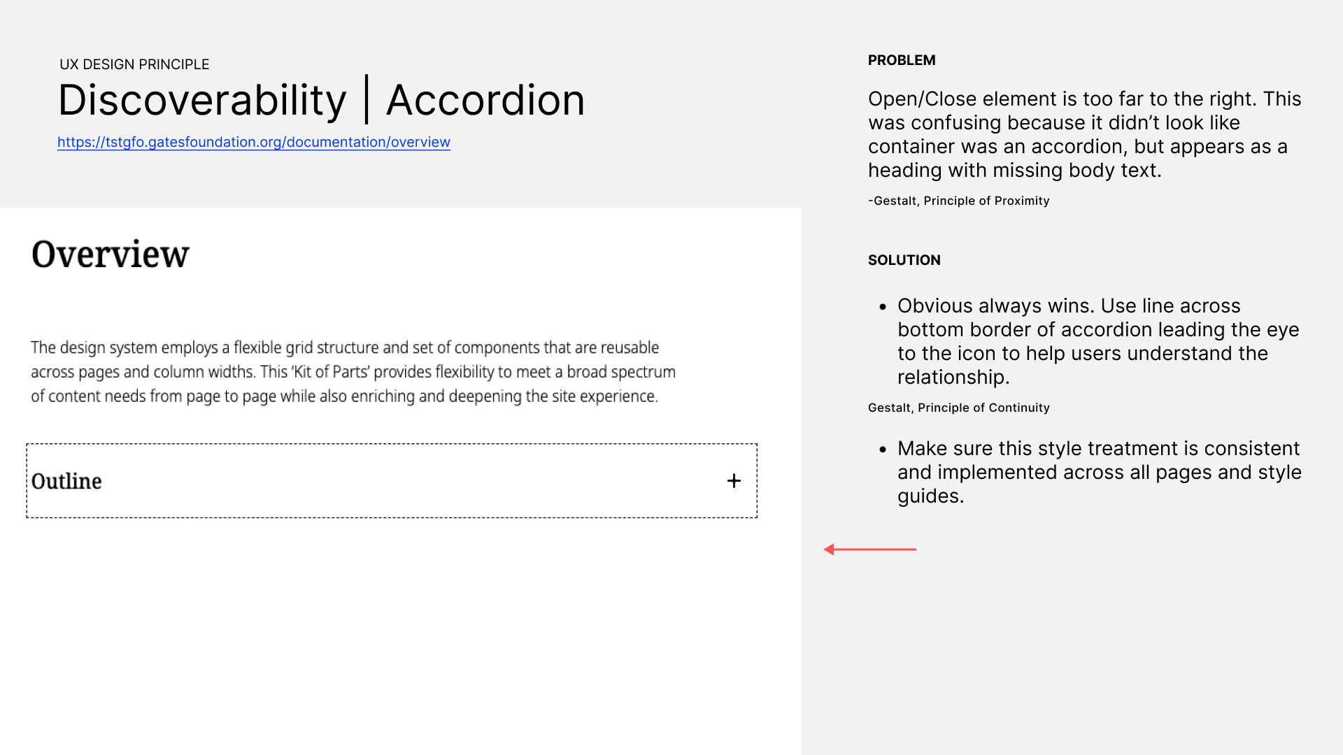
- On a large screen, the open/close element of the accordions was too far to the right. There was also no underline, or anything to draw your eye to the other side of the screen to indicate the text was clickable/expandable. Upon looking at the page for the first time, it appeared to just be a list. Note: In image below, item is in the keyboard "selected" state so the dotted outline shows in this instance.
SOLUTION:
- Use line across bottom border of accordion leading the eye the icon to help users understand the relationship.
- Make sure this style treatment is consistent and implemented across all pages and style guides.
PROBLEM:
The active state of the menu looked like an open/close toggle, giving the impression that the items listed below it were part of that category (in the design file). According to the design style guide, the icon should only appear on the active page. Yet, even so, there should not be icons that look like + or - symbols because the interactivity does not match the common established mental model of what will happen when the user clicks it.
In addition, there were too many conflicting underlines and bold text interactions making it unclear what the meaning of the visual change meant.
SOLUTION:
- The indented style is ENOUGH to show that a page is a sub-page or child. The icon on the left is unnecessary.
- Use only one visual indicator the page is active
- Use a different visual indicator for the hover state.
- Use either "bold font" or "underline" to show active state.
- Remove underlines on active page because that underline also appears as an indicator that the link is clickable.

PROBLEM:
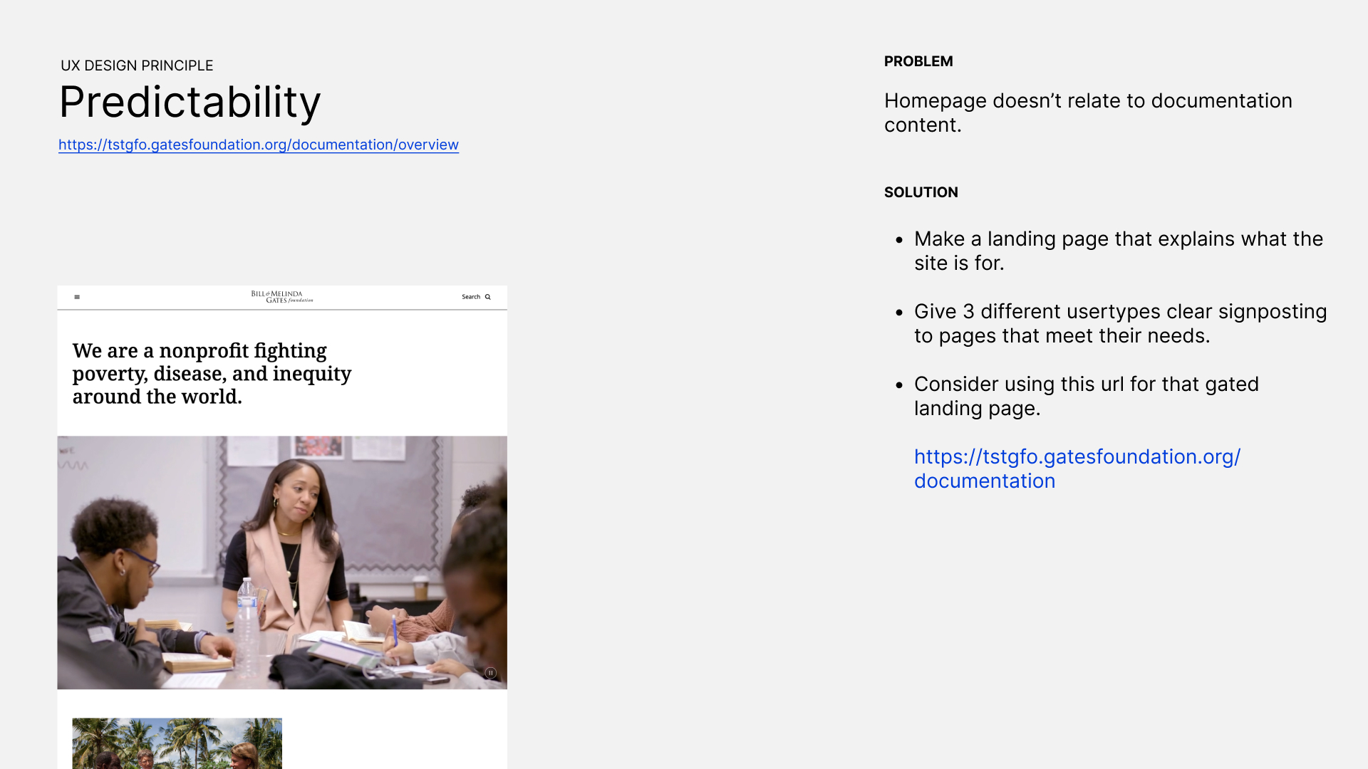
- The homepage of the documentation does not relate to it's content.
- The homepage of the documentation looks like it is the actual homepage of the main website where published articles are output.
- This is disruptive and confusing.
SOLUTION:
- Make a landing page that explains what the website is for.
- Give 3 different usertypes clear signposts to pages that will meet their needs.
- Consider using xxx URL for the gated landing page.
PROBLEM:
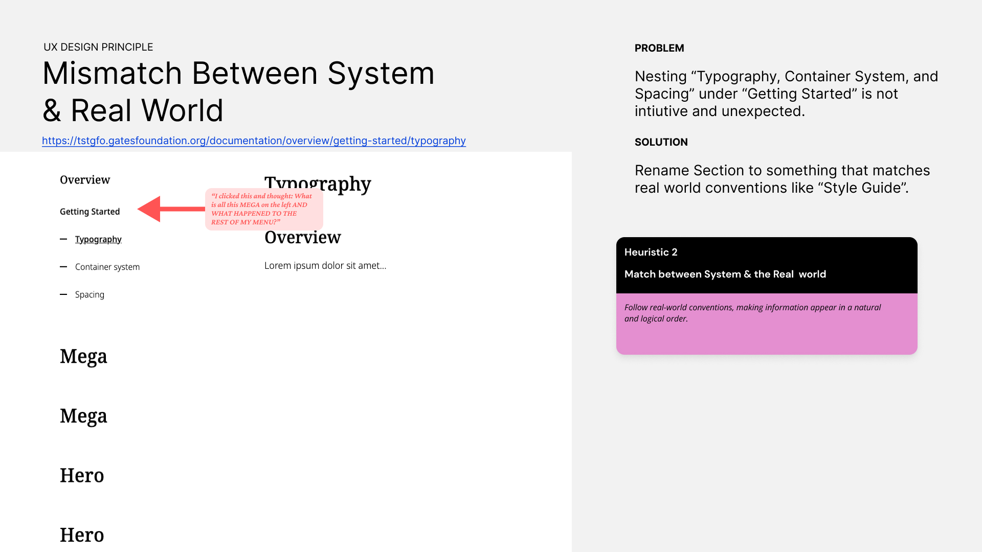
- Nesting "Typography" category under "Container System" parent.
- Nesting "Spacing" under "Getting Started" parent.
- This categorization is not intuitive and unexpected.
SOLUTION:
- Rename the section to something that matches real world conventions like "Style Guide".
GOALS:
1:1 interviews: To understand needs and creation workflow of each user type and their mental models for IA. Have them walk us through how they use (or would use) the current documentation. We would need both experienced and inexperienced participants.
Card sorting exercise: To establish proper categories and labels.
GOALS:
Implement findings from testing into final UI design.
At this point we could do another round of testing, or just prepare for dev send off.
It would have been immensely helpful to understand what the user workflow was for each user type. The inability to talk with the users was due to the company not understanding UX's capabilities.
In my presentation of findings to the internal team, I could have been more tactful in how I presented problems with the design. I didn't realize someone on the dev team was responsible for the work, and that they felt proud of it, so I felt pretty bad that I may have hurt their feelings. Now I know to find out who designed something so I know how to approach discussing it depending on their personality.