
Complete digital transformation of Boston provider network's online experience serving over 700,000 patients annually.

In 2023, I redesigned the public website to streamline navigation and enhance access to core digital services such as virtual care, provider search, and online billing. My role focused on interaction design, navigation architecture, content strategy, and UX flows across these touch points.
Senior Experience Designer
• Director of Experience Design
• Business Systems Analyst
• UI Designer
• Atrius Stakeholders

Display of averages. Dig deeper later.
IMPROVEMENT
Time on Tasks
IMPROVEMENT
Task Success Rates
IMPROVEMENT
Clicks to Completion
IMPROVEMENT
Task Abandon Rate
Many of the general goals of the website were discovered a few years before I started on this project, so for me, I started straddling the discovery & IA phase, which is where the technical problems I needed to solve for resided.
How might we make it easy for users to find a Primary Care Physician that meets her needs, schedule an appointment, and get to the appointment?
How might we design the website so customer service at central registration gets less calls about things unrelated to making an appointment?
How might we make it easy for content entry specialists to know which fields they need to populate, what recommended word count is, and which are editable?
How might we support the users who don’t know us?
How might we improve the experience across the following categories?
Seamlessly Design Open Scheduling @ MyChart after launch?
Support new AND existing patients?
Attract new patients?
How much user research/testing do we have budget/time for?
Reduce interaction cost?
Make language patient friendly?
Differentiate the Getting Care landing page from Patient Information?
What content design will be needed where pages will be restructured or net new?
What content is redundant or outdated?
How to make sure UX and SEO are aligned in strategy?
Who will own content updates and SEO management post-launch?
What are the single and repeating content blocks we need to build?
How will we structure this new website? Simplify Navigation?
Can the common mental model for getting care be improved?
How will the global navigation display & how many levels will we show?
How many levels will we show in the sub navigation?
How do we link between sibling products in a sub-category?
What is the best way to display mobile navigation?
What categories are important for users to search and filter to find a physician?
Which categories of physician information are outdated or unused by physicians?
Should we display the advanced search open by default?
In what order will these categories be displayed?
Which data will be automatically populated within physician and location profiles?
Which categories need to be front facing? Which can be hidden (in tabs, accordions, etc)?
The first thing I did was researched up-to-date interaction patterns within the healthcare field, focusing on find a doctor and location searches. I also used data from positive user testing in a previous project and also drew inspiration from local competitors ZocDoc, Zillow, Yelp and AirBnB. The main problem was deciding the best way to display advanced search and card display.
.png)
.png)
%20(1).png)
.png)
I created a presentation based on what we knew about users and how we wanted them to feel as they moved through the touch points of being introduced to the network and making their first appointment.

I assessed the page structure of first and second level pages to understand similarities/differences between current page modules and what components we would need to design for a consistent experience.


Assessed in tandem with client for outdated, un-necessary, current or need-to-write.
Assessed where content was useful, outdated or could be modified and designed a high level site map for client review.


Assessed in tandem with client for outdated, un-necessary, current or need-to-write.
Either way, I needed to decide what items would go under each category and what the category labels would be. There was no time for user research and no budget allocated.
There were many data fields for and too much scrolling so some of the less important information needed to be tabbed. Another option was jump links.


.png)

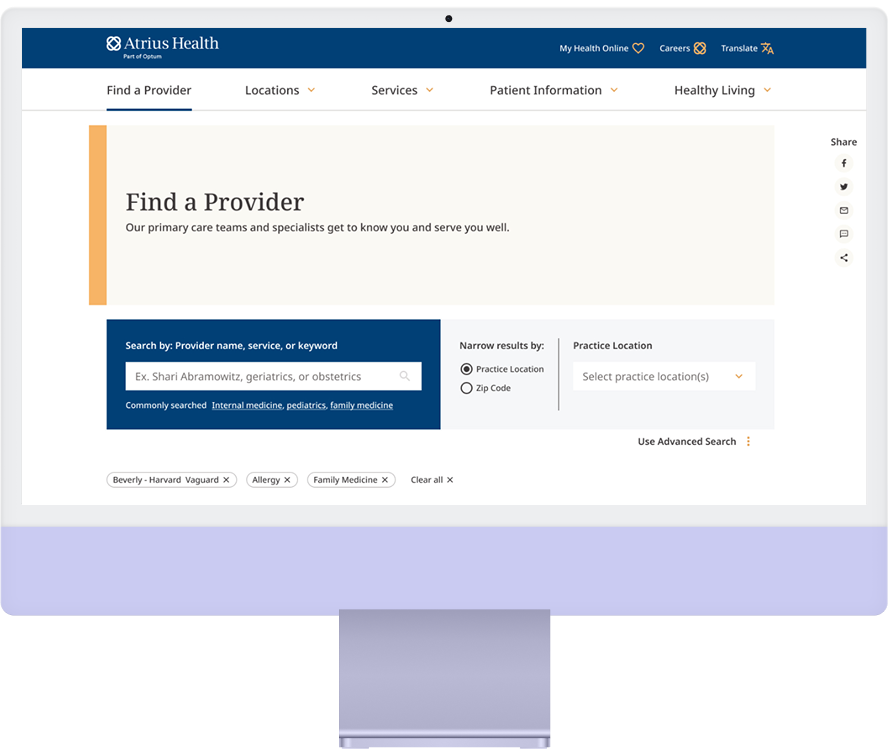
There was alot of debate about what fields needed to be in the search, and how it would function, and if advanced search should be hidden by default. Ultimately this is where it landed.
.png)
.png)
What would the default search radius be?
If we are including a field for users to check the box for the facility they know, and they put in the wrong radius, how do we prevent a search that yields no results?

Functionality of original location search.

When I was designing the “Find-a-Location” and “Find-a-Provider” search, all the client asked for was a list of results. Nowadays, users expect to see a map and look for locations nearest them. Plus, users would expect to see results in this way because that is how the find a location search functioned.
To add this feature was not in scope, but after talking to our developers, and account manager, we decided it would be low effort, why not design this if we had the bones for the functionality already developed and it would create a better user experience?
I pitched the idea to the client, and they wanted it, so it was a big win for our company.

I created wireframes for the pages in the global navigation, selected sub pages (to make templates) and the search detail pages.

After wireframes were completed I wrote directional copy then collaborated with the content designer / copywriter to write new content where needed and make language more user friendly and on-brand.

Overall, the project was successful and the client was both enjoyable to collaborate with and very satisfied with the outcome. However, we identified opportunities for improvement in our process. Conducting UX research early in the engagement would have provided benchmarks for later comparison and clearer validation of our work. Additionally, having dedicated content design support during wireframing could have replaced placeholder Lorem Ipsum with realistic content from the start. The updated information architecture required creating new intermediary landing pages and merging similar content, highlighting the need for dedicated copywriting resources in the project budget. Ensuring UX involvement throughout every design review phase, including UI, would have proactively addressed accessibility concerns and confirmed appropriate link signifiers. Despite these areas for refinement, the experience provided valuable insights into enhancing our internal processes and team communication.